Color plays a crucial role in recognition and influences the emotions of players. Therefore, choosing the right color palette for your 2D game is an important aspect. In this article, we will explore how to select a suitable color palette and provide detailed information on color palette selection from experts in the field of 2D game art. Check out the details below.
Choosing the right color palette for your 2D game
Below are specific steps to help you choose the right color palette for your 2D game.
Determine the objectives of your 2D game
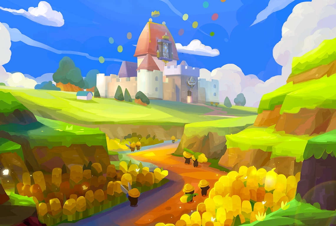
Before delving into choosing the right color palette, it’s crucial to assess various aspects of your 2D game. Begin by defining the objectives and primary message you want to convey through your 2D game. Colors serve as a powerful tool for messaging and ensuring a consistent player experience. For instance, if your game aims to instill a sense of humor, employing bright and lively colors can establish a cheerful atmosphere.
Next, identify the target audience for your 2D game. A game designed for children might leverage vibrant and diverse colors to captivate their interest, while games catering to adults may opt for more sophisticated and aesthetic color schemes.
Of course, consider the genre and intended mood of your game. For instance, a horror game may rely on dark and ominous colors to evoke fear and suspense.
In essence, thoroughly review the overarching theme of your game to establish a color style that aligns with it. This foundational understanding will pave the way for a more nuanced and detailed color selection process.
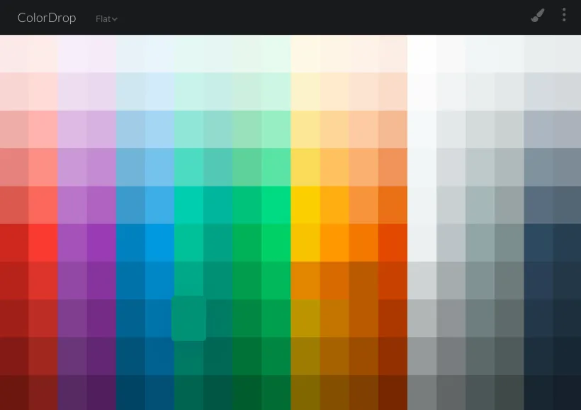
Understanding color theory
Understanding color theory is of utmost importance when choosing colors for a game. Specifically, a unique and consistent color palette can effectively convey emotions to players. Moreover, a professional color palette ensures that your game stands out and remains easily identifiable. Here are some fundamental concepts of color theory:
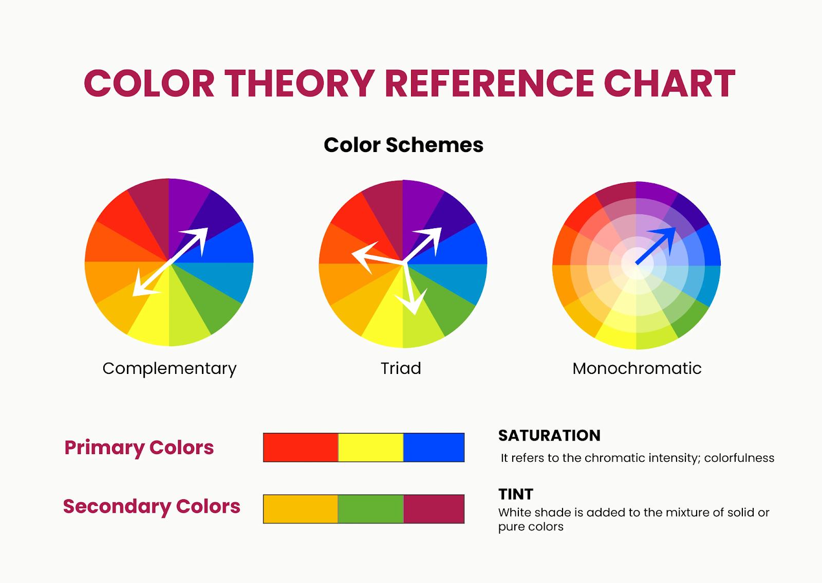
- Basic Colors: There are three primary colors that serve as the foundation in the RGB color system (red, green, and blue) and CMYK (cyan, magenta, and yellow). Through these basic colors, you can create different hues by combining or contrasting them.
- Warm and Cool Colors: The distinction between warm and cool colors is based on the feelings they evoke. Warm colors like red, orange, and yellow bring a sense of warmth and vitality. In contrast, cool colors such as blue, green, and purple create a feeling of tranquility, coolness, and relaxation.
- Receding and Advancing: This concept in color theory relates to the perception of space and depth. Dark, muted, or cool colors often tend to recede, while bright, vivid, or warm colors tend to advance.
- Color Contrast: Contrasting color pairs, such as red and green, create prominence and a clear distinction between elements.
- Value Contrast: Value contrast refers to the difference in brightness or darkness between colors.
- Saturation Contrast: Saturation contrast is the difference in the intensity or vividness of colors. Utilizing saturation contrast helps create balance and coherence in your color palette, aiding players in recognizing important elements.
- Harmonious Colors: Harmonious colors are grouped together on the color wheel. Colors within the same group or color scheme often create a sense of harmony and relaxation in design.
Broadly speaking, color theory forms a fundamental basis that includes various aspects. Therefore, implementing color theory in game design necessitates thoughtful consideration.
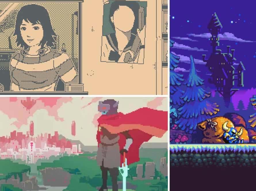
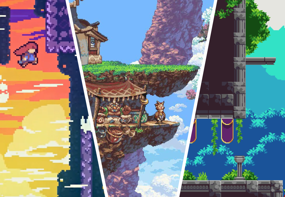
Studying the color palette of professional 2D games
Researching professional 2D games involves selecting some well-known and high-quality 2D games relevant to your project. Study how colors are utilized in these games and how they interact with each other. In general, analyze why these games apply specific color combinations in their contexts. From this analysis, extract valuable insights to develop your own 2D game.
Additionally, you can refer to reviews and feedback from players regarding the use of colors in those projects. Such opinions can provide essential information on how colors interact with players and influence their overall gaming experience.
It’s important to note that researching the color schemes of other games is a process of understanding, analyzing, and synthesizing information to gain new knowledge. From this, you can creatively design the color palette for your own 2D game. Avoid directly copying color palettes from other projects, as it may lead to confusion and diminish the uniqueness of your product. Moreover, it raises legal and ethical concerns.
Testing color palette for your 2D game and iterating

After researching and determining the color palette, proceed to test it by applying it to various scenes within the game. Observe how colors interact with different elements such as characters, environments, and objects. Here are some factors to consider:
- Check if colors accurately reflect the emotions and mood of the storyline.
- Place similar colors close to each other and observe whether they interact positively or negatively. Contrast and interaction between colors can affect visibility and information readability in the game.
- If there are any special effects like lighting, shadows, or motion effects, test them under various conditions. Ensure they don’t compromise the clarity of the colors.
- Organize tests with a group of players or gather feedback from your community. Understand their comments on the color palette and whether they find it comfortable and engaging.
Overall, the process of testing and adjusting colors is an ongoing one. Based on test results and feedback, make adjustments to the color palette of your 2D game as needed. Repeat these steps as necessary to ensure that your color palette is not only visually appealing but also supports the goals of your game.
Some considerations when choosing a color palette for your 2D game
- Avoid using too many colors, as this can make the game appear cluttered and hard to perceive. Limit the number of colors to maintain a tidy and manageable color palette.
- Use colors to create clear contrast and differentiation between crucial elements such as characters, items, or the environment.
- Don’t forget to adjust the colors generated by combining two or more basic colors. By altering the ratios of basic colors, you can create a rich and diverse color scheme.
- Maintain consistency in your color palette throughout the entire game. This helps create a cohesive experience and minimizes visual clutter.
- Test your color palette on various devices and screens to ensure that the colors display accurately and attractively across all platforms.
- Keep an eye on the latest color trends to ensure that the color scheme of your game stays contemporary and doesn’t become outdated.
In Conclusion
So, we have guided you on choosing the right color palette for your 2D game. Overall, the process of selecting a color palette requires a lot of effort and knowledge about colors. Be persistent and don’t hesitate to iterate. Remember to invest time in both research and testing; I believe you will have a perfected color palette. If you have any requirements for 2D game art, feel free to contact us; 7swordsgames is more than capable of assisting you.